Agua de Madre
A vibrant asset refresh following a lauded brand re-design.
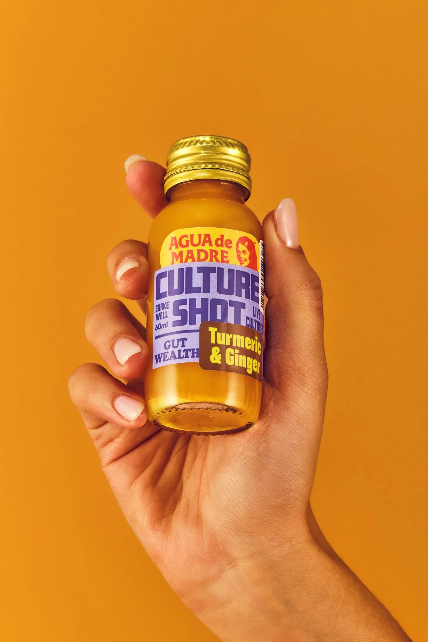
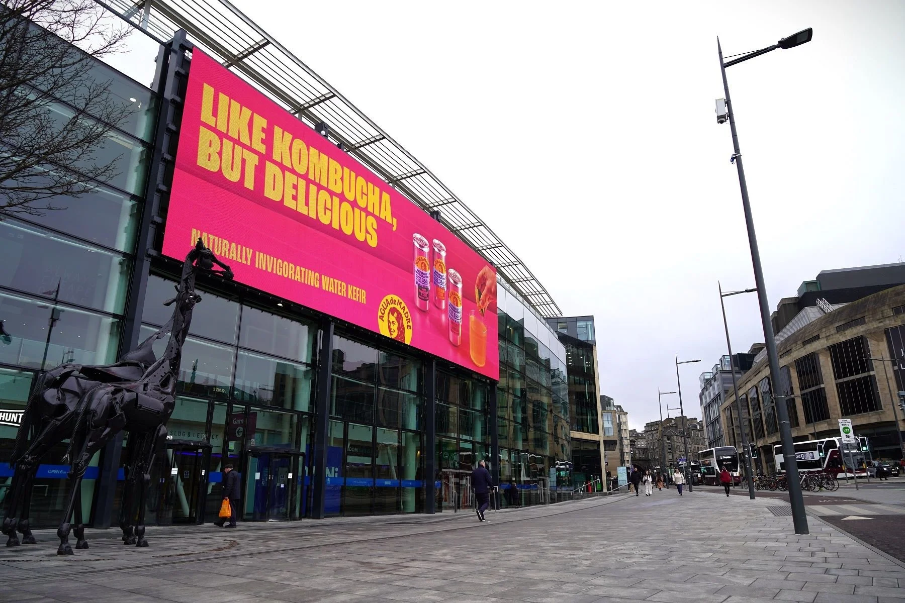
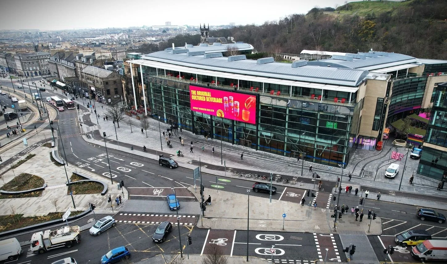
The project intention was to create a saturated colour-blocked world that was simple and graphic – like the new packaging – drawing on a loosely 1960-1980s palette. The two-day shoot created a range of assets from single product to groups, with and without hands, and was utilised across billboards, press and social channels.